

Branding collateral.
““AS A customer I WANT to know what to expect from a brand
SO THAT I feel comfortable and confident when shopping””

Logo sketch exploration.
Project:
Create a new visual identity for UK based, Drapers nominated, unisex fashion retailer Diffusion. The branding must translate across their online presence, physical stores and all printed collateral.
Overview:
Diffusion is a highly successful fashion retailer. Established in 1989 it a has a loyal following both locally and nationally. Specializing in designer labels as well as contemporary streetwear, the brand appeals to a vast clientele. Having started with one retail location, they now have 6 brick and mortar stores located across the midlands in the UK, a website and the largest amount of G-Star RAW franchises in the UK. The decision to relocate their flagship store from it's original location to one of the city's most historic buildings prompted the desire for a re-brand and visual overhaul of the companies identity.
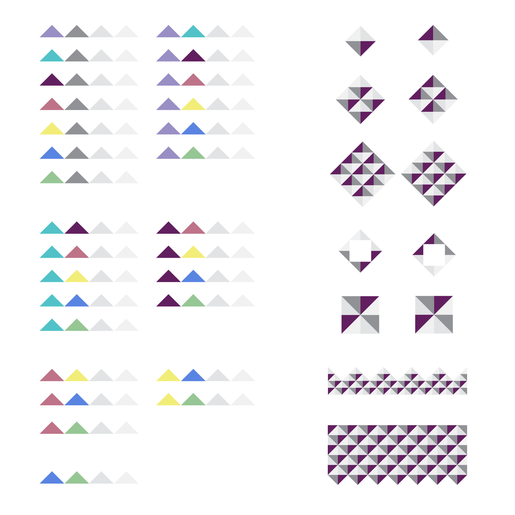
Color and pattern exploration.
Process:
The aim for this rebrand was to ensure whenever someone saw a piece of collateral, whatever the medium, they instantly recognized it as Diffusion. We wanted to ensure trust and loyalty with our existing and potential customers by creating consistency and brand awareness.
The starting point for discussions was around the logo. After many conversations it was determined that the original Diffusion logo would stay, and the focus of the rebrand would be on an accent and an updated color palette to bring the visuals to life.

Brand guidelines.
Family and friends are a huge component of the Diffusion brand, the company was originally founded by 2 close friends who still run it today. It’s a close knit community and they actively strive to turn customers into friends, then friends into family. I felt that this was great starting point to explore visuals. I sketched ideas with regard to circles and triangles, the idea of “coming full circle” and the 3 points referencing back to customers, friends, family. We eventually landed on a simple triangle that could be utilized in numerous ways to make a continuous pattern that could work cross medium.
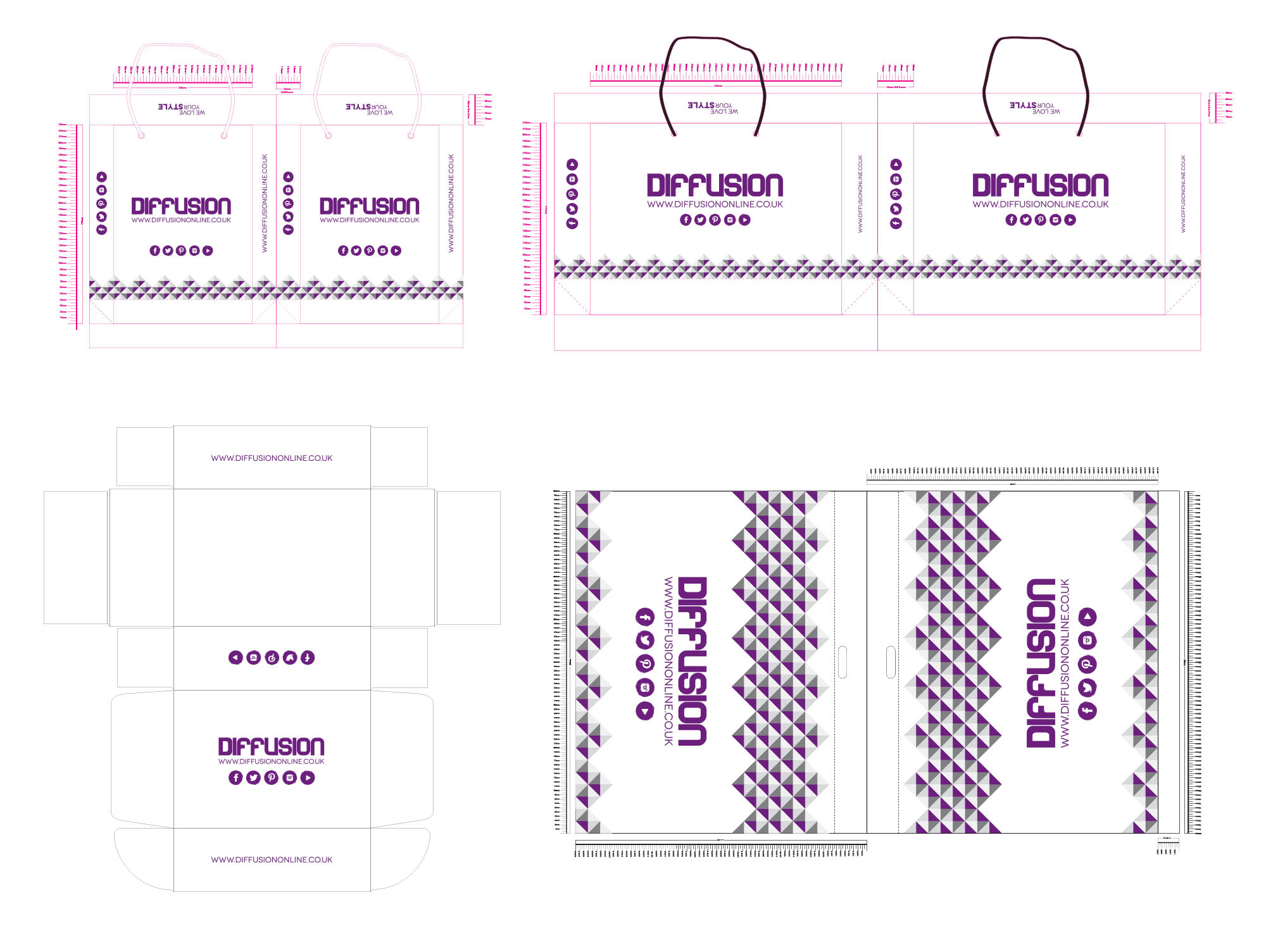
Store bags and box designs & online order bag designs.
The color palette was the next area of exploration. Being a unisex retailer catering for adults and children the palette needed to be all encompassing. We tried a variety of combinations and finally settled on varying shades of purple and grey after doing in-store user testing and onsite A/B tests.

Branding collateral including, business cards, bags, flyers.
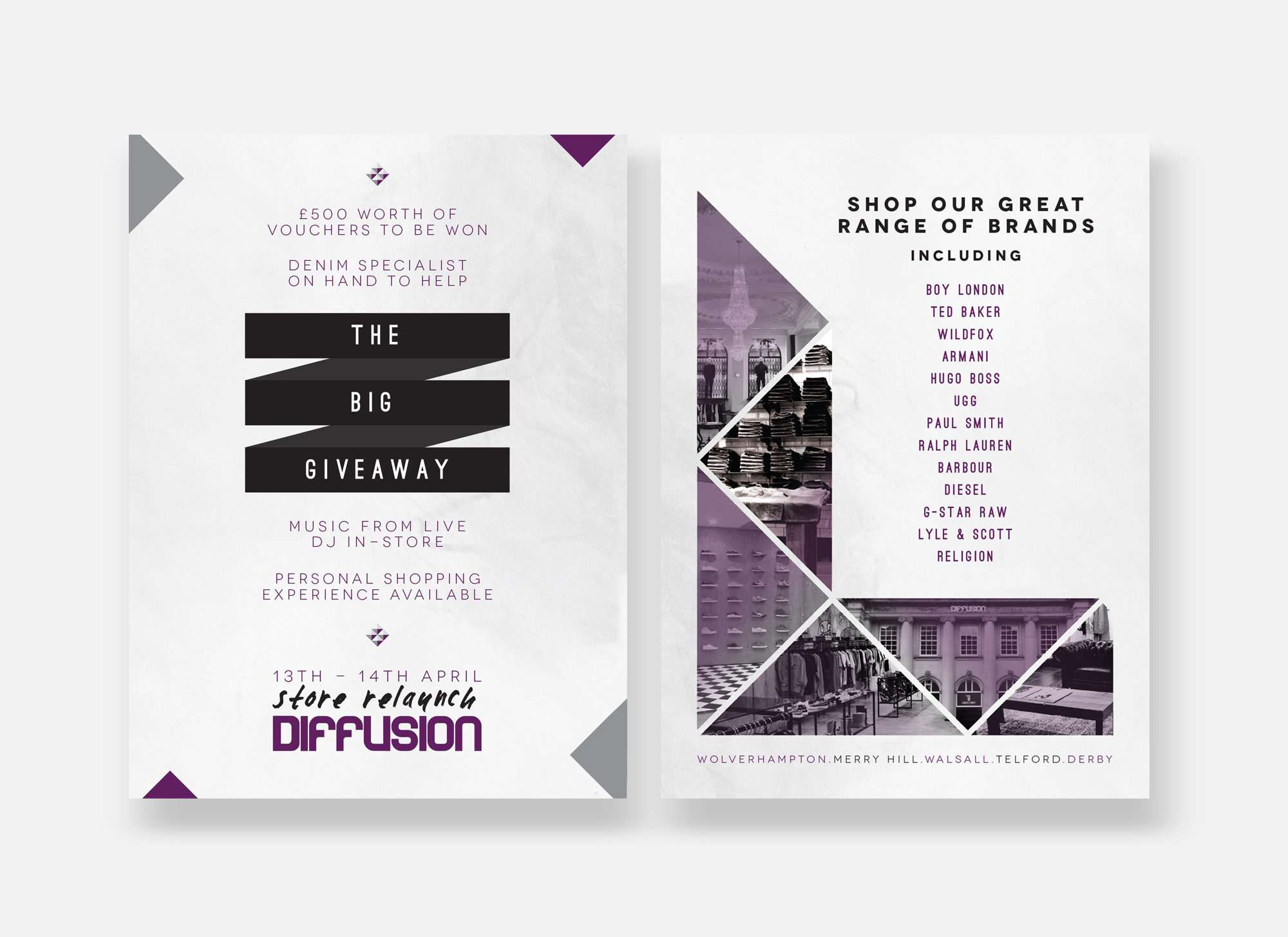
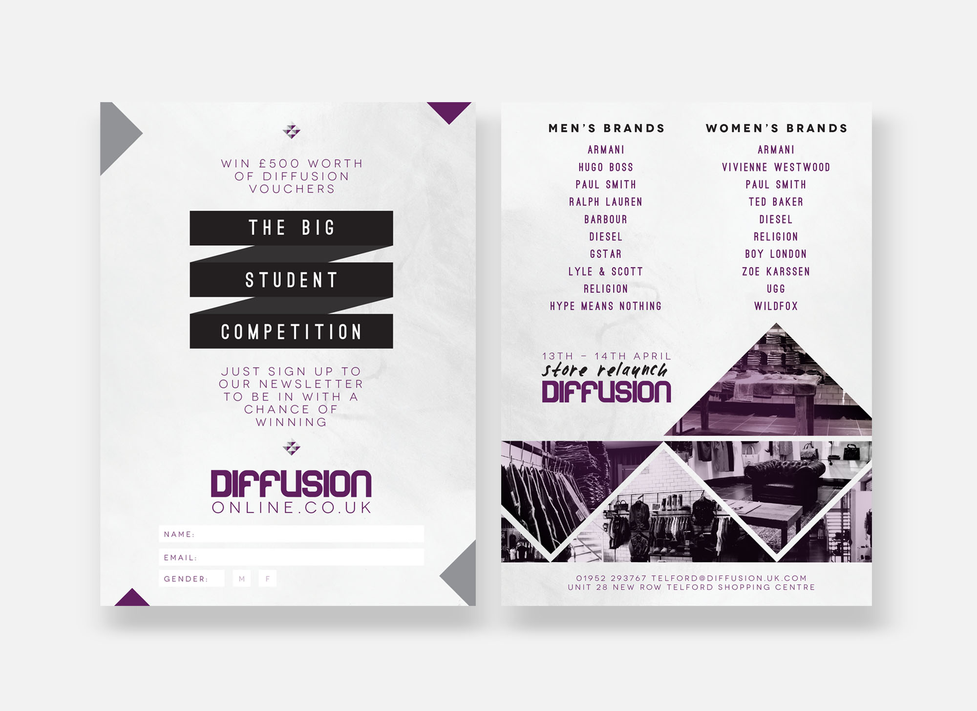
Once the main elements were established the design was then transferred across all collateral, including bags, business cards, clothing tags, flyers and site components.

Bag designs.
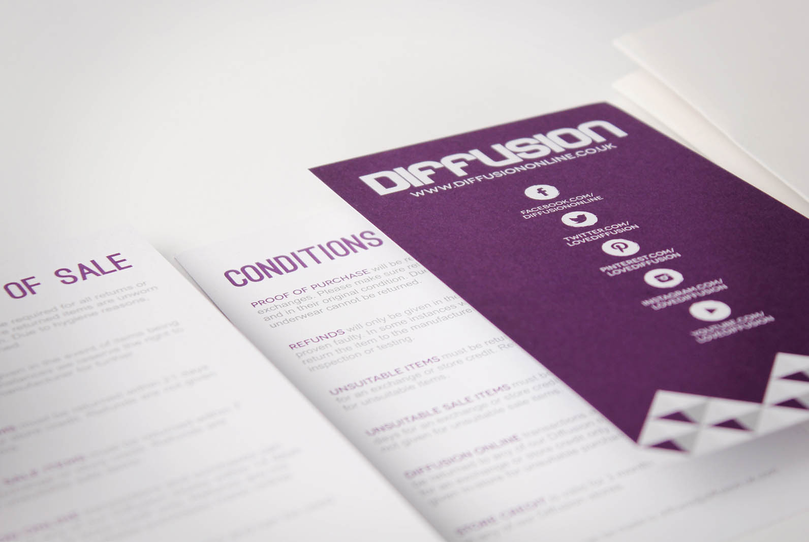
Conditions of sale.


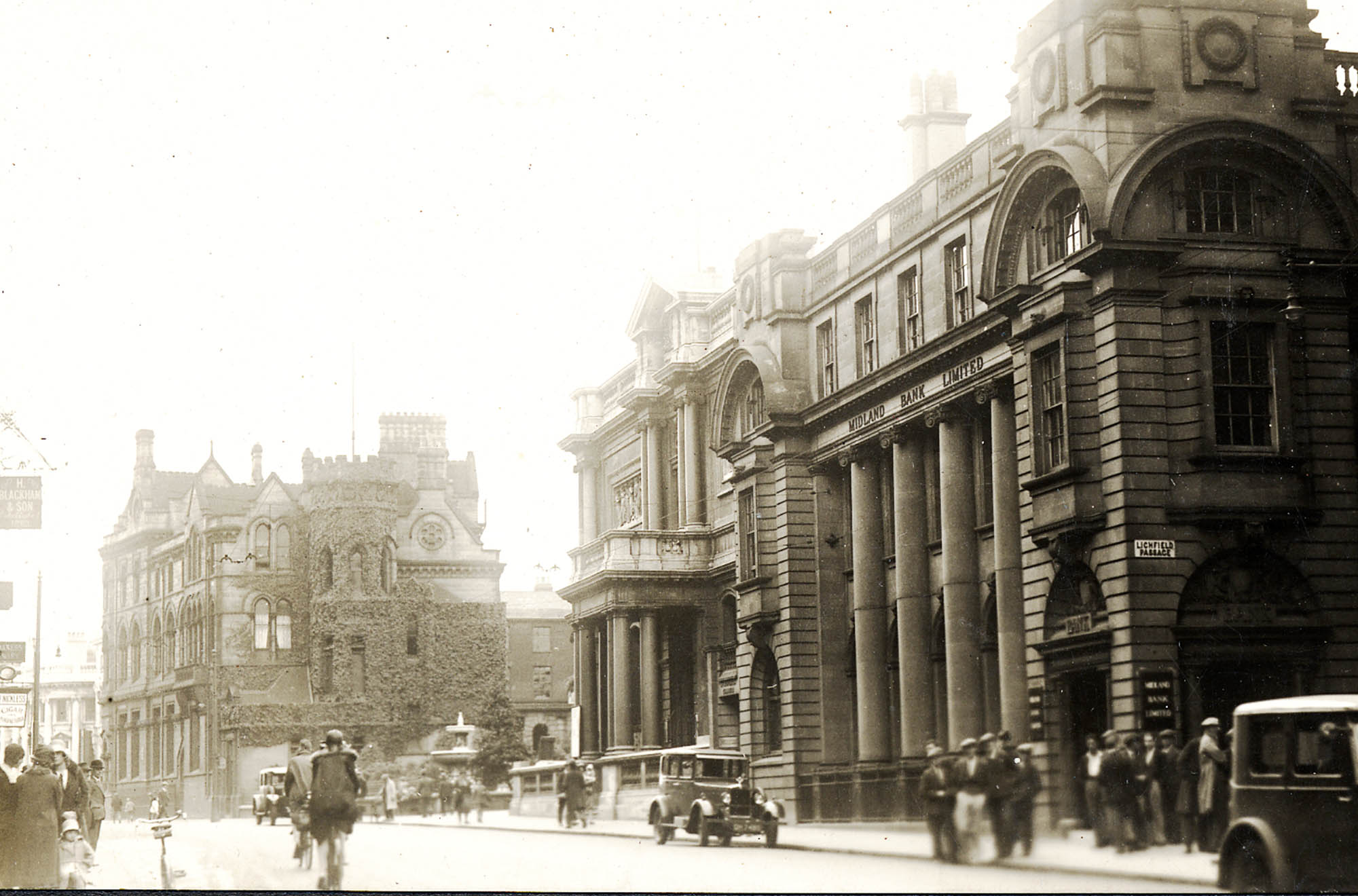

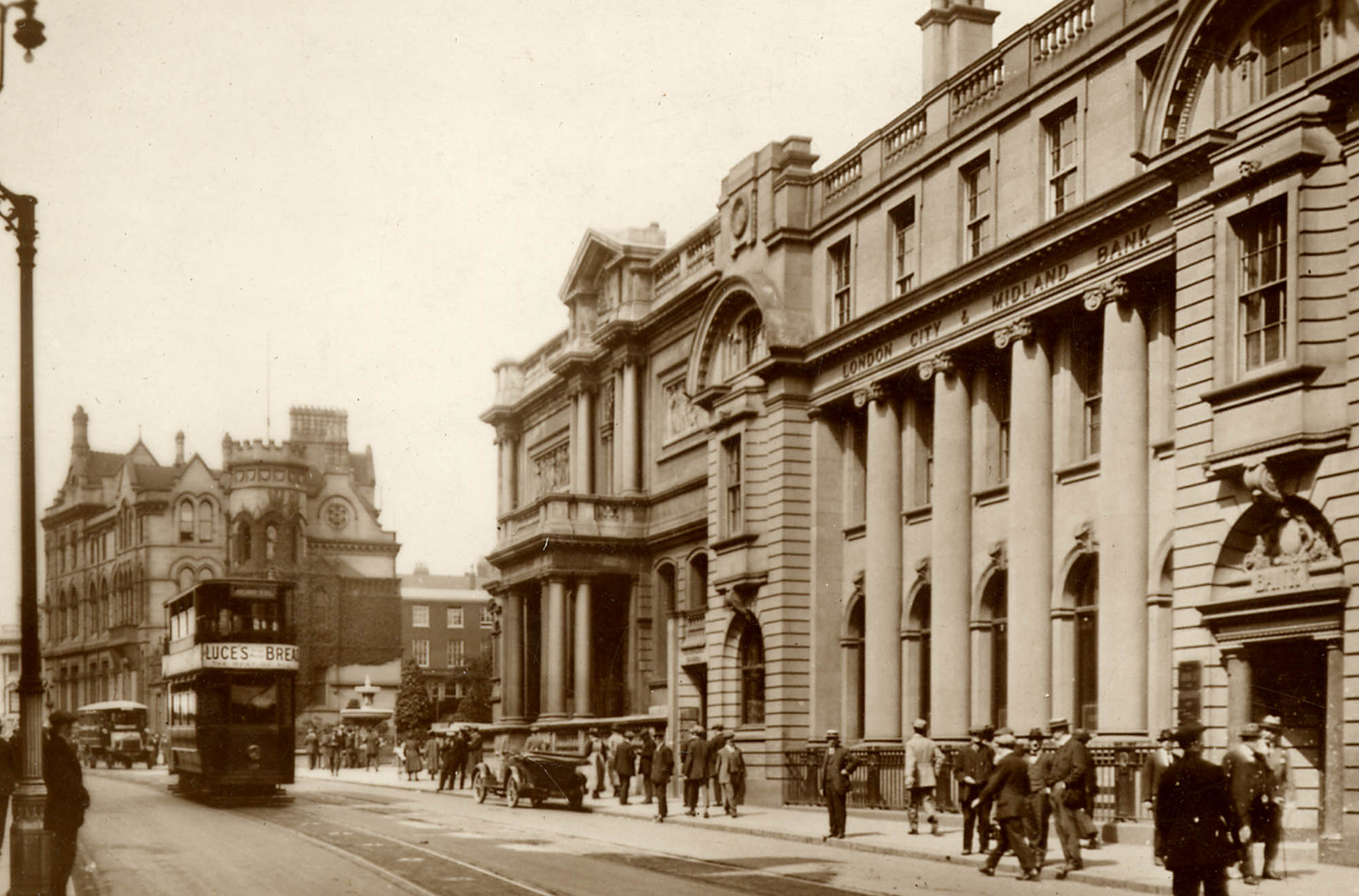

We went to the local library and unearthed images of the building acquired to be the new Diffusion flagship store at different points during history, these can be seen above. Originally Midland Bank, it has also been a bar and restaurant and is located in the heart of Wolverhampton city centre right next door to the Art Gallery. The building needed to completely gutted, but certain original features were able to be salvaged to give a nod to the buildings heritage. The exterior of the store maintained it's original look with the columns, arched windows and railings still in place.


Above shows the refurbished interior of the new Diffusion flagship store.
With the new store opening coinciding with the new visual identity, we decided to embrace the history of the building in the collateral that informed about the grand opening. We used the images of the original building we found at the library along with shots of the brand new interior as the main visual elements alongside the color palette and triangle patterns.

Printed magazine advert.
Window Vinyl.
Printed flyer designs....

The new online store would be a template design from Visualsoft, one of the UK's leading e-commerce platforms. We were able to to customize certain elements of the site to fit within our new visual identity. One thing I strongly advocated for, was the addition of a email marketing software company to be brought in so we could capitalize on the many events, special offers and new arrivals the business had. A deal was secured with marketing company Pure360 and I helped create a personalized, custom preference center that was integrated into the site. It allowed for fully customizable emails for our customers, we could send highly specific emails dependent on your buying or browsing history, the brands you shopped and the stores you frequented.

Desktop Preference Center design.

Marketing email for Preference Center

Social media marketing.
Outcome:
The transition to the new Visualsoft e-commerce platform increased sales drastically for the online side of the business, ensuring orders were made on time and refunds and exchanges handled much more effectively and efficiently. The implementation of the email preference center and the partnership with Pure360 saw an increase in user engagement of 67% due to targeted and specific email campaigns, along with increased email revenue and customer retention. The move to the new store gave it much more prominence in the city, resulting in a high increase in footfall, brand recognition and sales.


