““AS A customer, I WANT to understand simply and easily how to find my way around a site SO THAT I can concentrate on what I came here to do, shop””
Before - Starting point for Site, Mobile and App
Nordstrom Header, Navigation and Search, Desktop.
Nordstrom Left Nav and Filters, Desktop.
Project
Create a new header, footer and navigation system for Nordstrom Desktop, Mobile Web and App as part of the Site Modernization road map.
Numerous areas of the site had been highlighted for Modernization, with navigation being the first to go into the re-design phase. Along with the navigation adjacent portions of the site including the full header, search, footer and filters, all simultaneously being updated as they are directly impact navigating the site as a whole.
Our process will be:
- Brainstorm
- Research
- Hypothesis
- Concept Cars
- Usability Testing
- Incremental Implementation
Nordstrom Footer, Desktop.
Nordstrom App.
Nordstrom Mobile Header, Footer, Navigation, Search and Filters.
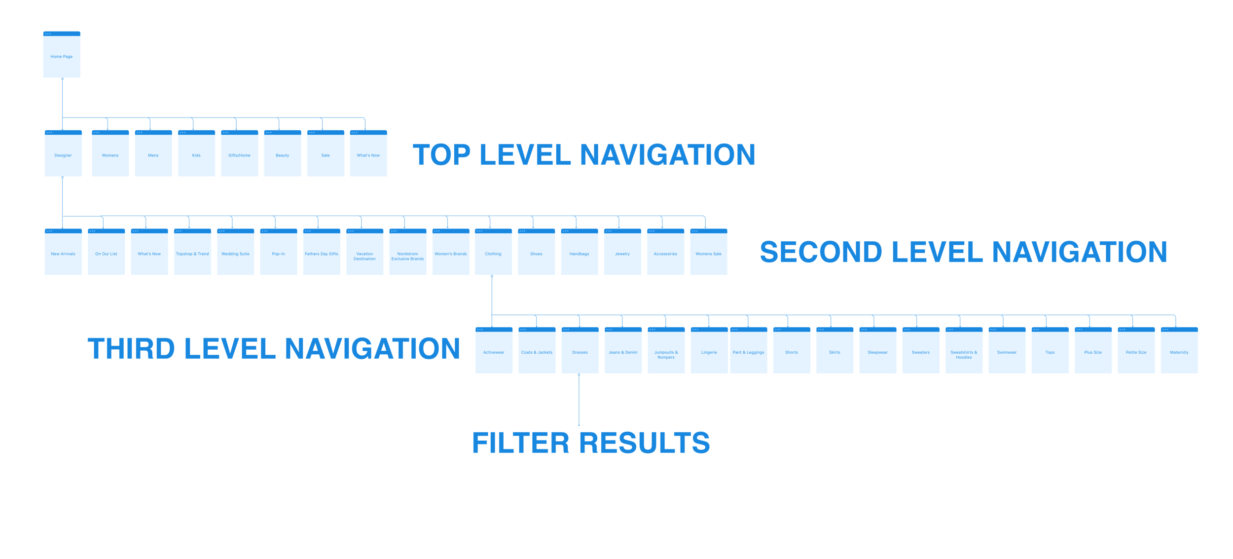
Existing site flow
Top level navigation & fly out navigation sub-categories.
Existing flow to women's dresses category
This is the flow a customer would take if they were looking for women's dresses - selecting Women's from the main navigation, Clothing, then Dresses followed by the options served up to the customer for narrowing down their dress search in the left hand navigation.
After:
New homepage navigation, filters & footer design: Desktop
See it in action right now on the live site: nordstrom.com
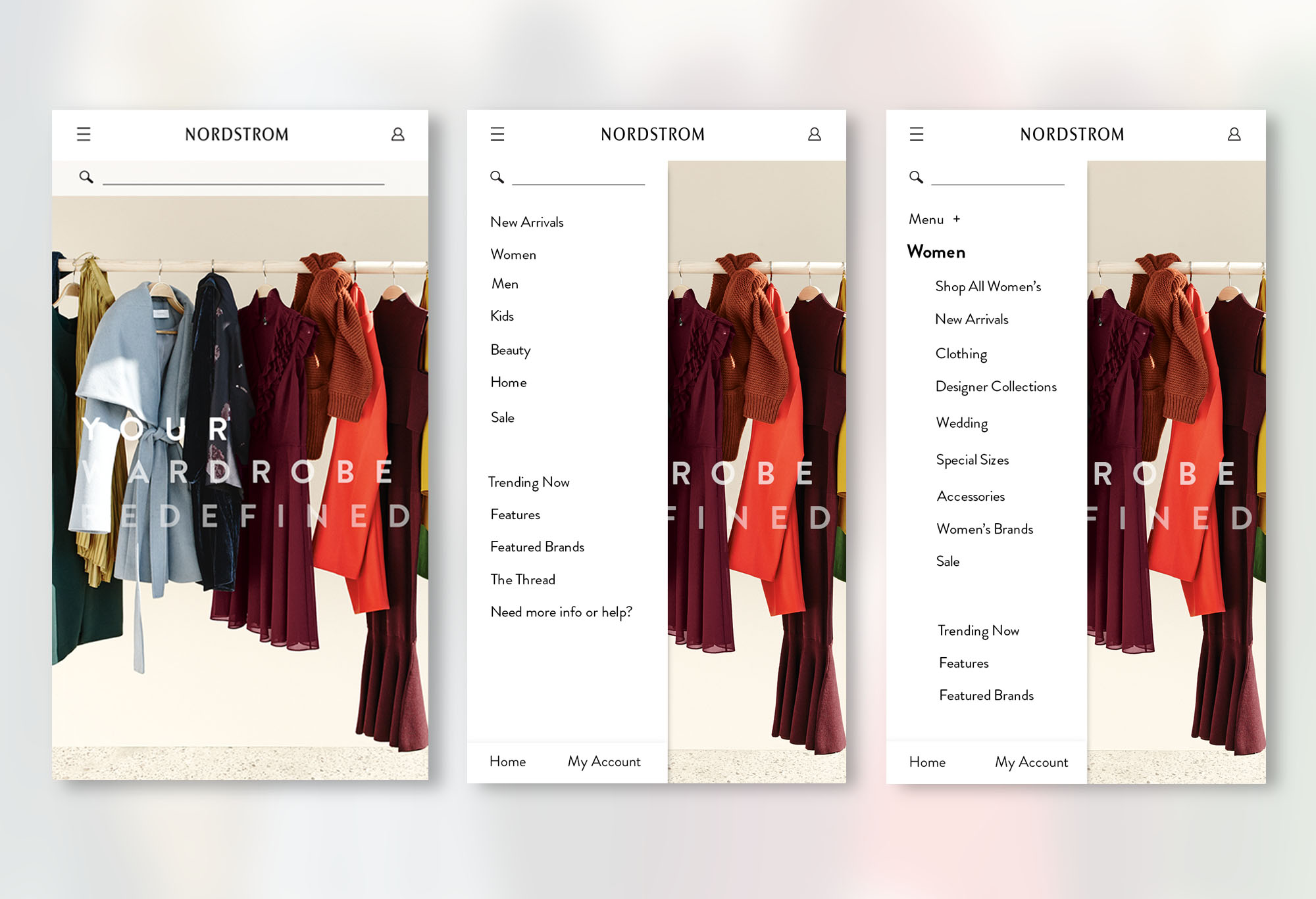
Mobile Web:
iOS Nordstrom App:
Updated site map
Updated flow to women's dresses category
Overview of project process:
To help define the problem space and uncover restraints we have today we asked all teams & stakeholders - business owners, product managers, UX, digital design - to participate in a brainstorm for pain points, job descriptions and concepts to move forward with, along with a general site audit. Below is a high level overview of what needs to be achieved.
Questions:
Do we need to expose so many categories at top level?
Could all 3 platforms have the same navigation?
How can we allow people to navigate deeper within categories without losing their trail?
What if top navigation and left navigation were merged together?
What is the value of the footer?
How many links is too many? How many is too few?
Is the bottom navigation on app valuable?
Is it better to have a static reliable navigation or one that adjusts to what's popular?
What if our filters could exclude verses include?
Why are there so many paths to the same product?
What if the footer was merged with navigation?
How could search be more inviting?
If we put Shoes under Women's exclusively, would the customer still find it?
Problems to solve:
- Too hard to narrow results: Filters and navigation are disconnected causing confusion around what narrows and what broadens the results set.
- Overwhelming: We have more links than competitors. Customers don’t always know where a link will take them. Duplicating nav links asks customers to make too many choices. Streamlining is a clearer mental model.
- Disorganized: Navigation lacks clear hierarchy and consistency. Many pages can’t be found through search.
- Inconsistent: Navigation appears different on each platform.
- Not flexible: Our current navigation has so many links that we struggle to highlight Anniversary or holidays.
- Dated: Our navigation, filters and footer feel dated in their design & interaction.
- Difficult to maintain: Back end capabilities don't allow us to easily enforce consistent guidelines or test hypotheses because it’s highly manual.
Things to consider:
- Adding scripts to the header will increase load time.
- Hover navigation can be frustrating on PDP.
- Exposing rewards info.
- Bottom navigation on app in IOS & Android?
- Navigation needs to accommodate events and be dynamic.
- Ability to pick up where you left off?
Goals & vision:
- Intuitive, clear & concise: Make it easy to narrow the results set and find logical touch points for filters and links currently displayed in navigation and the footer. Clear relationship between navigation and filters for intuitive narrowing & streamlined browsing
- Fast & clear: Get customers to where they want to go faster by eliminating duplication and links that haven’t proven value.
- Search for anything: Make sure customers can get to every page by searching and not require them to navigate to it.
- Predictable & organized: Overhaul the information architecture for a consistent experience shopping across categories & devices.
- Flexible: Leave space to highlight sales, holidays & special events.
- Visually compelling, organized & streamlined: Redesign navigation, filters and footer to embrace the design direction of our flagship stores while feeling approachable.
- Easy to maintain: Automate navigation and filters; establish navigation templates and enforce guidelines; and easily test navigation in production.
Competitive analysis
Competitors - for Desktop and Mobile there were 15 e-commerce sites, 3 department stores, 5 visual design, 2 copy and 5 UX exemplars.
Nordstrom, Barney's, Net-A-Porter, Nasty Gal, Aritzia, Zara, Mango, Nixon, Anthropologie, Urban Outfitters, Amazon, Shopbop, Zappos, Revolve & Nike. Both Nixon and Nike did not have app presence, so only 13 apps were featured in the competitive analysis.
Research questions asked:
- What language are our competitors using to feature editorial or curated product?
- How do our competitors make their navigation visual, fun or engaging?
- Do our competitors blend filters and navigation? If so, how?
- Where do customers filter/narrow?
- What navigation method does the competitor use?
- Do our competitors repeat links in navigation?
- How does the competitor help the customer not loose their trail?
- Is the top nav and sub nav separate or merged?
- Is there a clear difference between editorial and objective categories?
- How do you get to brands?
Highlights & takeaways:
New Arrivals was the most popular curated link, Editorial the second most popular and Featured was also repeatedly used.
Language variations included - New, New In, New Now, What's New - Editorials, The Edit, Edit, Stories - Featured Shops, Features.
On desktop, 9 out of 15 competitors displayed images to supplement text links, 14 out of 15 competitors on mobile, and 11 out of 13 on app used simple typography to create hierarchy.
On desktop, 14 out of 15 sites exposed top level navigation links by default. On hover, 12 sites displayed a flyout with subcategories. 2 sites displayed subcats on click. 14 out of 15 sites display a left nav on results pages, many time repeating the exact same subcategories they displayed in their top nav.
On app, 8 out of 13 apps displayed a menu entry point which then exposed top level links. 4 apps exposed navigation links on the home page and used a click to show subcats.
On desktop Nordstrom had 14 elements in the header, average was 10, 9 of those on Nordstrom's were non-essential.
On desktop, only 1 out of 15 competitors had a completely merged navigation in the form of a left nav.
Previous usability findings:
Site audit & heat map study:
Heat maps depicting monthly click through showed that the Women's tab and Search were by far the highest clicked areas of the header/navigation, receiving well over 2 million clicks in a month period. In comparison Pop-In, promo banners, the Nordstrom logo and Gifts were the least clicked ranging from 7,000 to 74, 000 during that same month.
Tree testing examples:
You’d like to see the hot new items for fall. Where on the site would you browse what's trending this fall for yourself?
Answer (women): Women > Style Watch > Fall Essentials
Answer (men): Men > Style Watch > Fall Essentials
Direct success: 7 females, 2 males
Indirect success: 4 females, 8 males
Failure: 18 females, 17 males
11 out of 18 women who failed this task chose the link “Savvy Trends” within the Women’s category. This may have been because they keyed in on the word “trending” within the task, but more research is needed to better understand the effect this may have had. Men tended to choose items within clothing categories that were possibly related to fall. While fall-type items can be found within clothing categories, this result elevates an issue with the term “Style Watch” in that it doesn’t necessarily lend itself to browsing.
Recommendation: Rename “Style Watch” to something that more closely matches the content located under it (seasonal trends, guides, lookbooks, etc.).
Imagine that you and your family love North Face products. Where would you find all items sold by North Face?
Answer: Designers > View All Brands
Answer (women): Designers > Women’s Brands
Answer (men): Designers > Men’s Brands
Direct success: 12 females, 12 males
Indirect success: 4 females, 7 males
Failure: 13 females, 8 males
Those participants who failed this task did so because they chose links to clothing items within their gender categories that were most likely to have North Face products (e.g. Activewear, Coats & Jackets).
Recommendation: Watch for higher than normal brand searches, which could signify confusion with the title Designer in the global navigation.
You’d like to buy a diamond tennis bracelet. Where would you find a diamond tennis bracelet?
Discovery Tests:
Customers adapt quickly to change - we should innovate on behalf of the customer.
Customers like subcategory links of fly-out menus, as long as they are grouped appropriately.
Having a top level navigation link does not guarantee improved sales for the category.
Editorial content needs to be explicitly marked as such else it looses the customers attention.
Hypothesis:
- We believe that the site should embrace the design direction of the flagship store and convey our brand identity, white, airy, minimalist.
- We believe in less, but better: reduce distractions, increase value by removing elements that are non-essential - Single line header, reduce header height, header changing based on your context on the site, hyper-focused checkout header, consolidation, single entry point.
- We believe we should only send customers to a destination if it is worthy.
- We believe there is value in a immersive search experience.
- We believe subcategories and filters should never overlap.
- We believe Navigation should be heavily weighted to objective categories.
- We believe in dynamic shopping experiences: explore ways to integrate personalization and persist search.
- We believe we need to aim for consistency but adapt to screen size.
- We believe we should be open to considering a top or left hand navigation.
- We believe any editorial subcategories should be grouped together and not intermixed with objective categories.
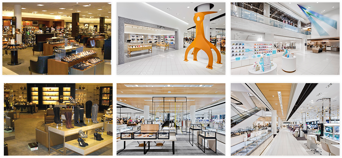
Store: Then & Now.
Design phase:
The Digital design team were tasked with pushing hard with our designs, we were told to think outside the box and not design with existing constraints that are currently stopping development on the current site. After lots of internal discussion and brainstorming we decided we wanted our ideas to explore the idea of a left hand navigation system. We were also working on the assumption of "Mobile First", and were using the idea of "if it works on mobile, why can't it work on desktop". We aimed to create a consistent navigational system that worked consistently over app, mobile and desktop with minimal changes across devices.
Design Idea 1:
This idea revolved around the idea of having no navigation visible at all on the homepage and utilizing the hamburger menu from mobile/app.
We also explored the idea of splitting the navigation into a purely shopping navigation and a separate user navigation. The shopping navigation would expose on the left hand side of the screen, whilst the user icon on the right hand side would expose a different menu, including all the users details, store locations, shopping bag, wish list and more.
Design Idea 2:
This idea was a much deeper dive into the left hand navigation, having collapsable categories, allowing a user to directly jump back and forth between navigational levels. The navigation would be fixed on the left through every screen and allows plenty of room for navigational additions.
The footer has been collapsed into a page option and can be accessed at the bottom of the menu. Filters would function as an entire page take over.
Concept car


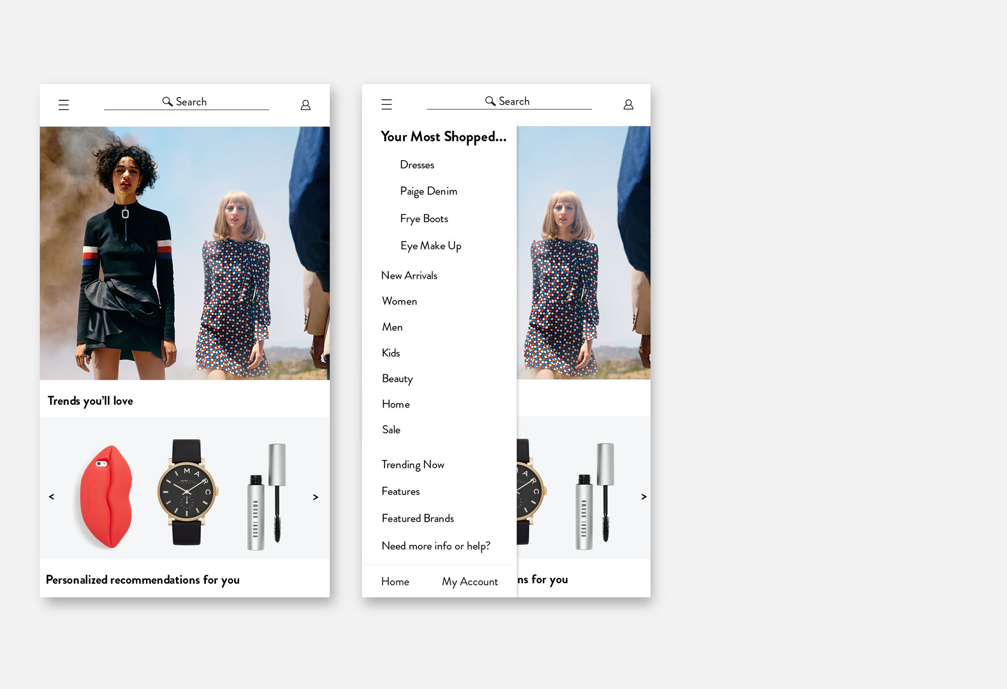
Elements
There were key elements that we wanted to incorporate into the concept car that addressed the pain points discovered in the research phase. We debated different ideas through sketches and brainstorming sessions and outlined the ideas we wanted to progress with.
- Consistent navigation across channels - Thinking mobile first, why could we not incorporate the same navigational structure across all three platforms, making it easier and simpler for the customer to shop cross-channel.
- Collapsable navigation on desktop - Navigation to collapse every level you get deeper into the site - how mobile works now.
- Consolidation of links - Streamlining top level navigation.
- Universal filter - Allowing the customer to have the ability to filter at any point through their journey - (ended up exploring this in greater detail for the homepage redesign)
- Footer as it's own page - Instead of directing customers away from the site for certain pages, keep them all contained and make it a place of value.
- Consolidation of account and shopping bag - Having one high level entry point instead of multiple links.
- Type ahead search functionality - allow the customer to get to all pages on the site through search, also to function as a breadcrumb - (ended up exploring this in greater detail for the homepage redesign)
- Filters as a full take over - Allow customer to be exposed to all the filters at once and make them easily understandable, removing an additional left hand navigation.
- Distinctive Editorial content navigation - Giving the customer an obvious entry point for inspirational editorial content that didn't get diluted into secondary of left hand navigation.

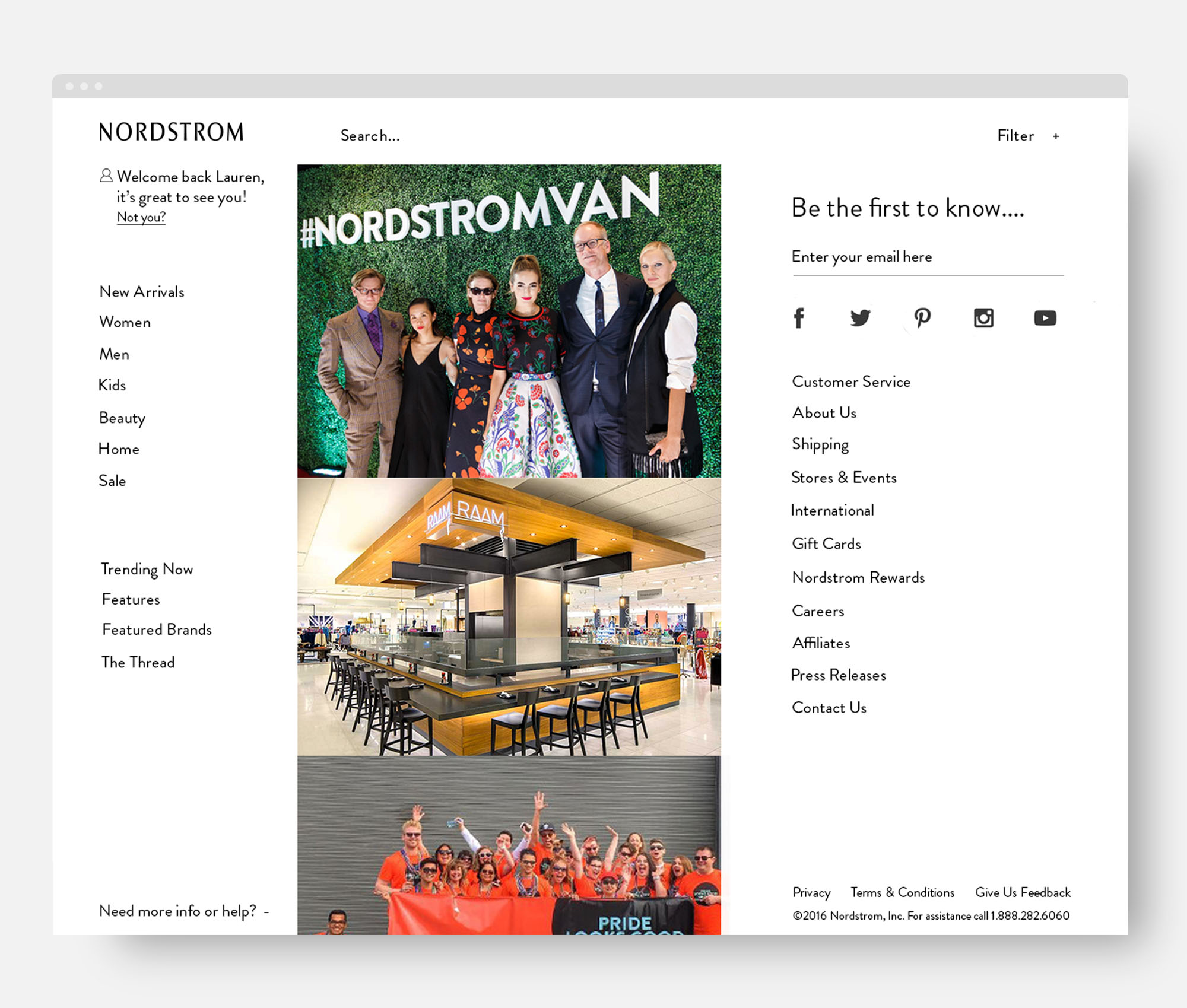
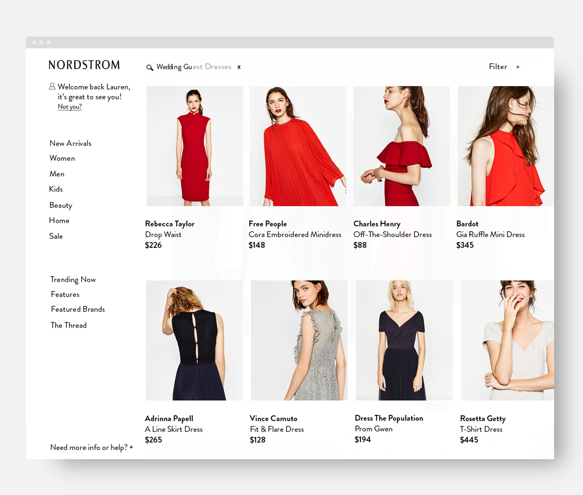


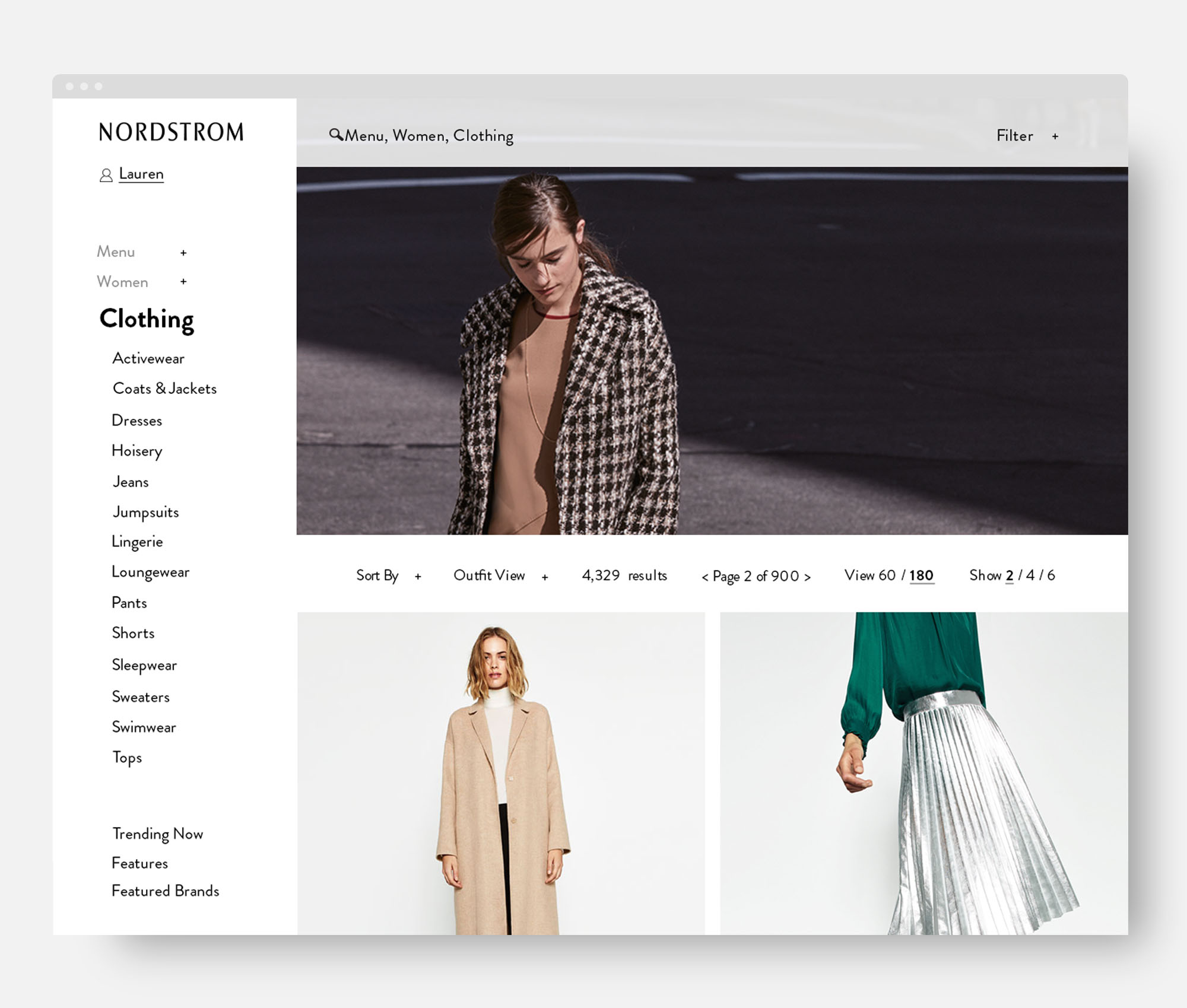


Usability Testing:
3 different navigation concept cars were tested by a total of 17 people representing a mix of target personas who shop both in store and online.
The purpose was to find out what aspects of the different concept cars are intuitive and enjoyable. The current Nordstrom homepage/navigation was also added to the test to see how it faired.
Top L to R: Design A, Design B, Bottom L to R: Design C, Design D
Users were asked to rank the different designs based on the following attributes:
Familiar, Inviting, Clear, Time Saving, Best in Class, Intuitive, Attractive
Design A ranked highest with an overall average of 4.0, closely followed by Design B scoring 3.8.
Design C ranked lowest with an average of 3.0 and Design D came third with 3.4.
Design A was familiar with its top level navigation and fly out menus. It was described as Intuitive, Organized, Clear, Clean and Sterile.
Design B was the most inviting with strong visual hierarchy, large fonts and bold images. It was described as Engaging, Organized, Clean, Intuitive and Elegant.
Design C ranked low because if it's complex left navigation and small font. it was described as Busy, Difficult, Familiar and Unattractive.
Design D was familiar to users but scored low due to being busy and cluttered. It was described as Clear, Familiar, Busy, Intuitive and Unattractive.
Overall Ranking:
Despite ranking lower on attributes Design B was ranked overall higher than Design A. Highlighting importance of imagery and white space.
Takeaways:
- Font and image sizing is critical - use largest practical font size against large images.
- Type hierarchy - helps the design feel clear and organized.
- Visual Clutter makes the design feel difficult and busy - look to create groupings via spacing, minimize use of lines and differing font styles.
- White space - to much can make things feel sterile and inefficient - explore different grid, spacing and image placement.
- Information Layering - can create designs that are efficient and clean - expose secondary capabilities in such a way that they are discoverable but don't interfere with the primary task.
- Centralize Functionality - Keep related functions together makes design feel organized - filtering and navigation are very interrelated, keep them together.
- Number of results - too many results is intimidating - ensure people can navigate a few levels down in the hierarchy and then filter.
- Don't underestimate the brand.
Second usability testing:
8 people, online and in-store shoppers, 1:1 1 hour sessions. Comparing left navigation and top navigation, determining pros and cons of the 2 models. Below screens show the screens of the 2 prototypes that were tested. Left Navigation followed by Top Navigation.
Left Navigation Results:
Navigating from the Home page to Women's Dresses, required 3 clicks and 3 page loads, it was called out for being inefficient.
The large images were appreciated and inspiring but also distracting.
"This design feels like you are trying to get me to buy what you want instead of helping me get what I want"
Left navigation was called out as being.... Clean, Predictable, Organized, Distracting, Intuitive, Familiar, Busy, Overwhelming.
Left navigation was rated an overall average of 3.8, based on how inviting it was, how modern, how efficient, how intuitive and how attractive.
Top Navigation Results:
Navigating from the Home page to Women's Dresses, required 1 click and 1 page load, it was called out for being efficient.
People liked that the menu showed all options at once. Appreciated exposed categories so they didn't have to drill down.
Top Navigation was called out as being.... Inviting, Organized, Distracting, Clean, Intuitive, Familiar, Predictable.
Top navigation was rated an overall average of 4.6, based on how inviting it was, how modern, how efficient, how intuitive and how attractive.
Takeaways:
7 out of 8 people preferred the top navigation.
People were accustomed to looking across the top for entry points.
Fly out was seen as efficient.
Left nav was seen as very organized but required too many clicks to get to desired areas.
Because the left nav had no preview there was more guesswork involved.
Reducing the number of top level categories did not appear to hurt discoverability.
People preferred the design with fewer top level items and larger fly outs.
“There are a lot more options right up front in the top menu. I can sit here and decide where to go. You will get me to think of things I wasn't coming in for.”
" The left menu is better. It helps me get to where I want. I don't need to see all these choices. It leads to "analysis paralysis“ for me.”
“I like top menu better. The left one start feels like it is in the way. It seems a bit easier to get to the categories in the top menu.”
"The top menu has a lot of words. It is a big map. I can see everything at once...this is perfect."
Left Hand Navigation/Filters testing:
Customers prefer to filter in the left nav.
Seeing all filters collapsed at the same time was appreciated.
Liked the ability to have multiple select.
Everything in one area improved ease of use.
Customers appreciated filters staying in view on scroll.
Customers appreciated auto collapse on filters.
Incremental implementation:
After studying the data from usability testing, regrouping with all stakeholders, having development and performance conversations, and doing plenty of A/B testing, a direction was outlined for the new Navigation, Filters and Footer design, to be updated incrementally.
This included:
Highly reduced single line header -
It was universally acknowledged by all teams/stakeholders that reducing the noise in the header was a positive enhancement to the site.
Many A/B tests were done to see where links should live, we went live with a new one line header still with all of our original links, once satisfied with results we reduced top level navigation links from 21 to 8.
Updated header size -
Narrowing the hight of the header was a must as it took up vital real estate, by having a single line header a lot of space was regained. The effort to make the site responsive was working parallel with this project, so the new header would also be adopting responsive breakpoints as well.
Live Brandon text -
In a universal Site Modernization push, we would be replacing our existing font with our new brand standard Brandon Grotesque, automatically modernizing the look of the header.
Updated iconography -
Simplified and modern icons were created to replace links for Account, Wish list and Shopping Bag. This new style of icon will be used throughout the site.
Marketing banner consolidation -
In the old header there were 4 spots for marketing messaging, and through our studies we found that the click trough success was minimal. We decided to focus on having one strong call to action in the new header/navigation. Allowing marketing messages to be dismissable.
Fly-out navigation -
After usability testing it was deemed logical to go forward with the more standard secondary fly out navigation for the site, it's trusted, the users reacted well to it and by streamlining, organizing and adding a background blur, customers were able to find what they were looking for effectively and efficiently.
Persistent header on scroll -
Introduction of a persistent header on scroll allowed the customer instant access to navigation throughout their journey on Nordstrom.com.
Consolidating checkout, shopping bag and account links -
Housing all account info under one link and all shopping info under the bag Icon to minimize disruption and confusion.
Not sending people to a destination if it's not worthy of a destination -
By containing similar links under one heading we can eliminate multiple pages customers have to go to, limited the amount of chance the customer may fall out of the shopping funnel.
Streamlined filters and removal of left hand navigation -
The left hand navigation on browse pages was one of the most confusing and stressful experiences for the customer. We will remove left hand navigational links and replace with our more elegant and streamlined filters to avoid causing more confusion for the customer.
Minimalistic UI design drawing on inspiration from flagship stores -
Embracing the new design direction of our flagship stores and new openings, the UI design will be modern, elegant and embrace white space as a tool.
Dynamic Shopping experiences, including personalization -
Utilizing information we already have about our customers, floating up valuable information that is tailored to them. Using visuals in navigation that are representative of the customers shopping habits.
Encourage sign-in for a tailored experience -
By having a customer signed-in we can provide a much more highly tailored and personalized experience, adding value to the customers journey. Encouraging signing up/signing in should be prominent all over the site, showcasing the benefits to the customer. Make them realize what they are missing out on.
Streamlined footer -
Consolidation of links in the footer and a more streamlined approach to pages.
Immersive search -
Customers will be able to search for any content on the site, including blogs, editorial etc and we will introduce type ahead search.
Slide one: existing header/navigation.
Slide two: First implementation, marketing placements consolidation, account links organized into a single entry point, “Redaptive” design implemented: The header stretches up to 1400px, no changes to mobile.
Slide three: Second implementation, shopping bag and checkout consolidated into a single entry point, Shopping bag clean up, Brandon Text implemented. Mobile: Iconography update to reflect lightweight aesthetic, Marketing moved to the top of the header to make it less of a distraction, while being more discoverable.
Slide four: Third implementation, Search UI update, flyout nav update, persistent header implemented. Mobile, header reduced to 1 row, search & navigation update.
See the new navigation, header, filter and footer on Nordstrom.com

